Poliart
Prints made from the data I work with every day: precinct returns, forecast simulations, and campaign finance filings. Each is generated entirely in code, with the data as the structure of the picture, and each has a short account of its mathematics underneath. The full-resolution files are free to download and use as wallpapers.
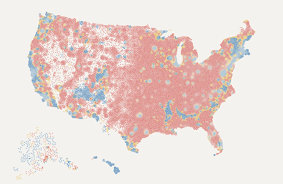
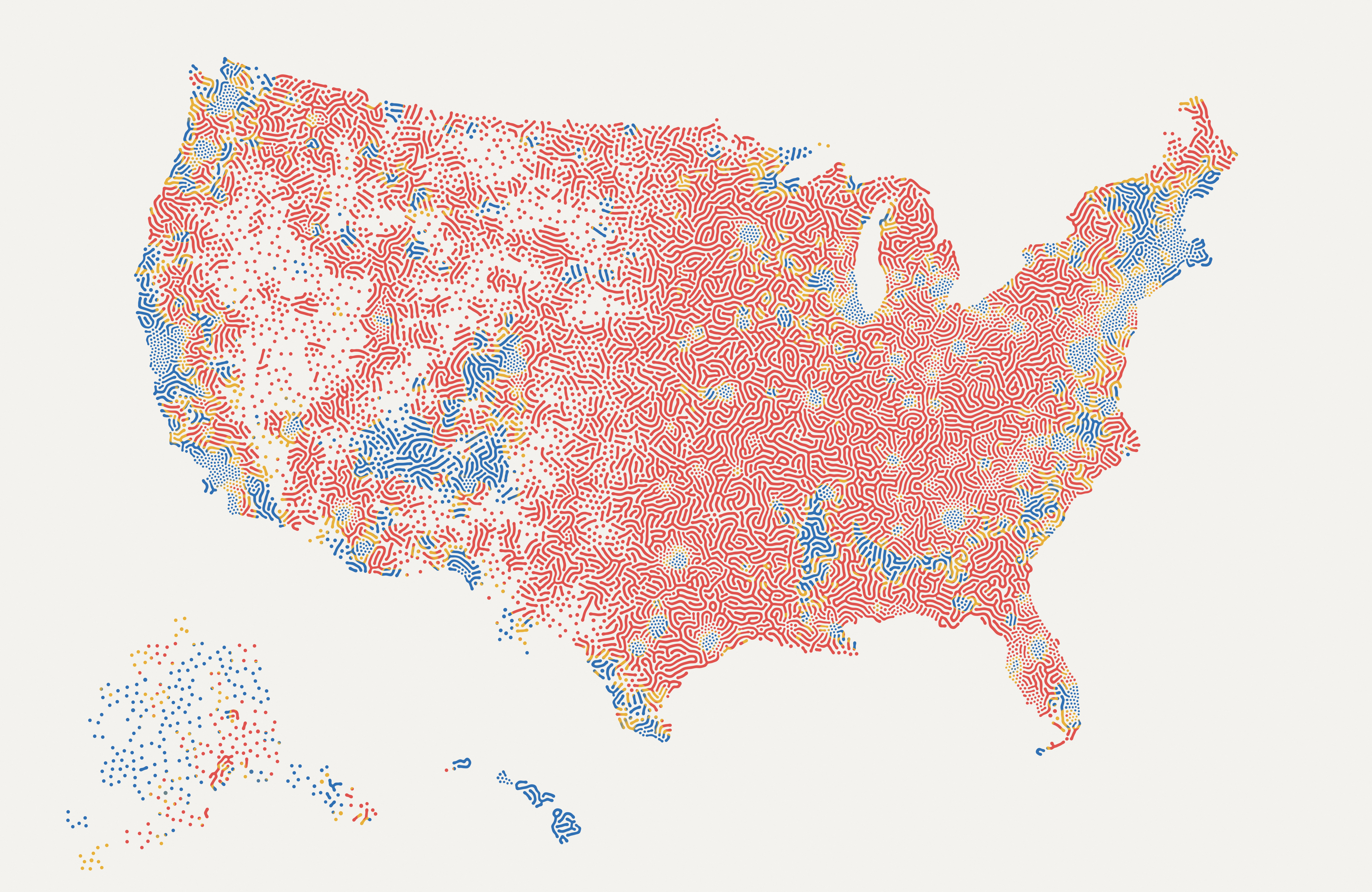
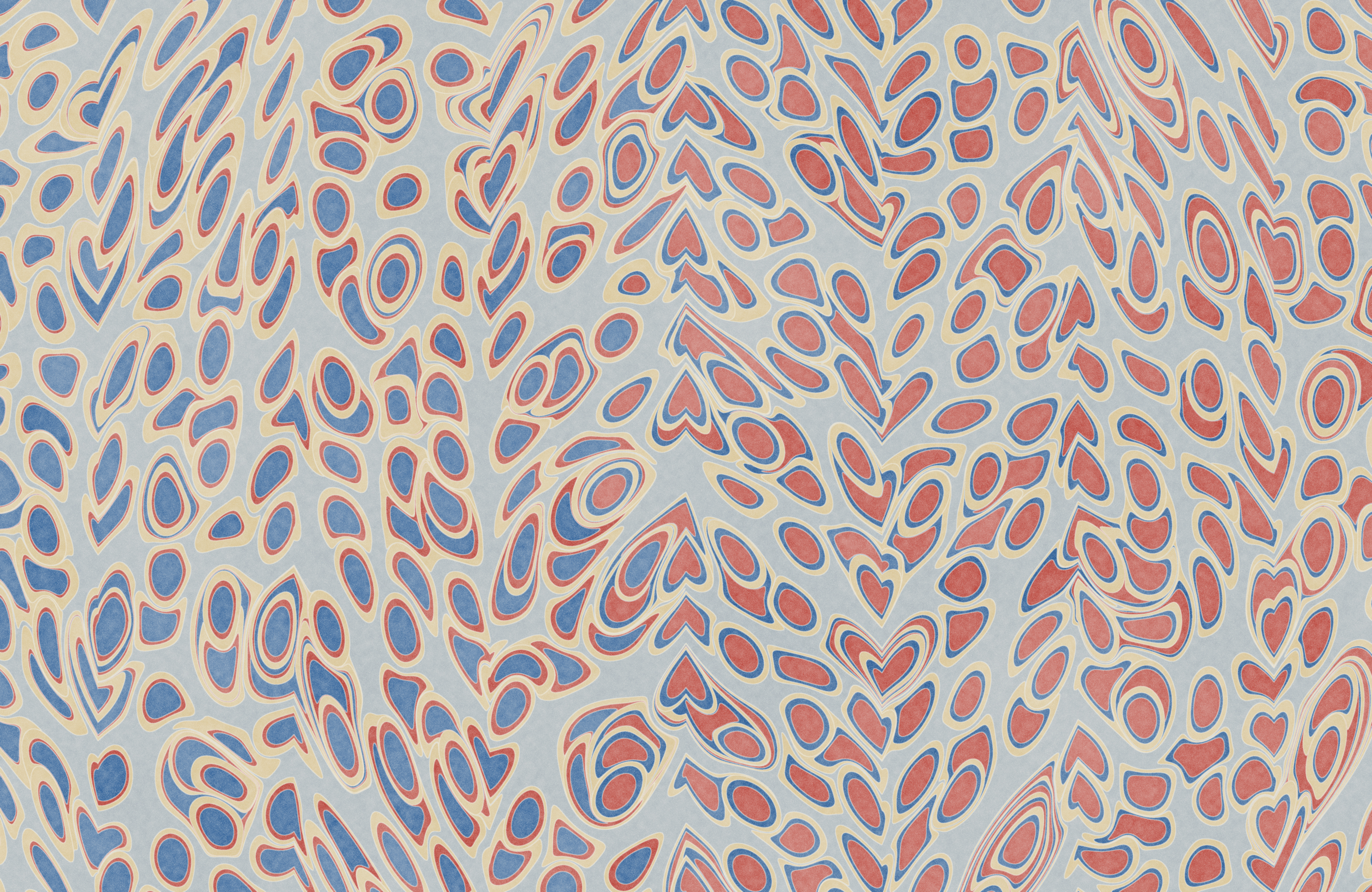
Turing America, 2026
A map of the 2020 presidential election that was grown and not drawn, the coastlines included.
2020 presidential vote in about 171,000 precincts across all fifty states. Alaska and Hawaii are insets, with Alaska drawn at about half the scale of the mainland.
The math
A Gray-Scott reaction-diffusion system, the kind of chemistry Alan Turing proposed in 1952 to explain how a leopard gets its spots. Two chemicals spread and react for 10,000 steps:
![\begin{aligned} \frac{\partial u}{\partial t} &= D_u \nabla^2 u - uv^2 + F(1-u) \\[4pt] \frac{\partial v}{\partial t} &= D_v \nabla^2 v + uv^2 - (F+k)\,v \end{aligned}](/images/poliart/tex/eq-08993d652d.svg)
The feed rate F and the kill rate k decide which pattern survives, and both are set by the logarithm of vote density, so empty land grows lone cells, settled country grows labyrinths, and metros grow fine dots. Where there are no precincts nothing survives, which is how the coastline appears. The margin sets only the ink: blue, red, or gold within eight points. Red covers most of the sheet because land does; the blue dot fields are where most of the people are.

Seat Ridges, 2026
A woodblock mountain in which every ridge is one possible Senate.
100,000 simulations from VoteHub’s 2026 midterm forecast, as of September 8, 2026.
The math
Simulations are grouped by the Senate they produced, from 39 Republican seats on the nearest ridge to 59 on the farthest. The height of ridge s above House seat h is a rootogram,
![\begin{gathered} y_s(h) = \sqrt{n_{s,h}} \\[4pt] n_{s,h} = \text{simulations with } s \text{ Senate seats and } h \text{ House seats} \end{gathered}](/images/poliart/tex/eq-e338ae7f0a.svg)
running from 128 Republican House seats at the left to 266 at the right. The square root keeps thin tails visible beside the peak, and the ridges stack into one mountain because the two chambers move together. The sun stands on seat 218, the House majority line. Its reflection carries no data.

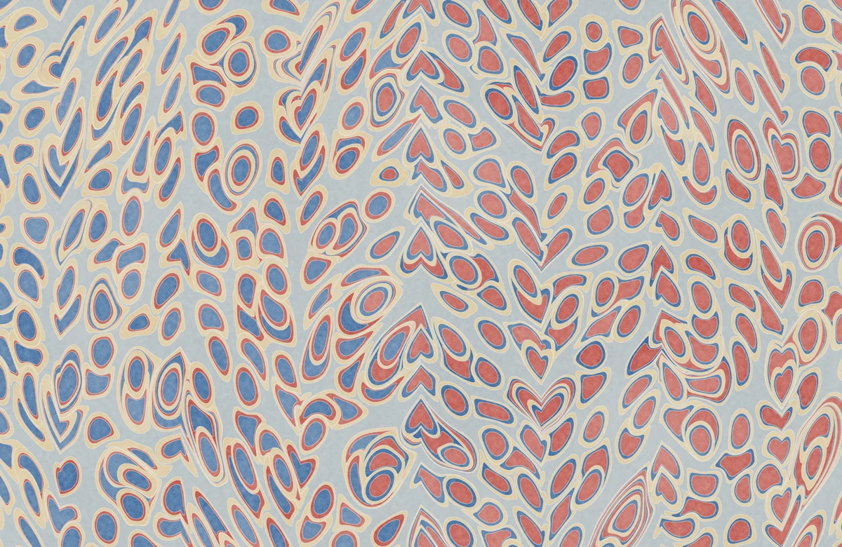
District Marble, 2026
A marbled sheet in which every drop of ink is a House district, and every patch of color is proportional to a number of people.
2024 presidential vote and voting-age population in all 435 House districts and the District of Columbia. VoteHub’s 2026 House forecast sets only the order in which the drops were thrown.
The math
A drop’s area is the district’s voting-age population, in three rings: adults who cast no major-party vote, then the losing party’s votes, then the winner’s at the center. In Aubrey Jaffer’s model of marbling, a new drop of radius r landing at C pushes every point P already on the bath to
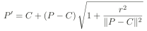
and a tine drawn down the bath at x₀ drags the ink beside it by

Both maps preserve area exactly, so however far a drop is squeezed or combed, each color still covers an area proportional to its people. Safest seats were thrown first and closest seats last, which is why the close races stay round.

Donor Meadow, 2024
A risograph meadow in which every blossom is a candidate for Congress.
FEC year-end filings for the 2023 to 2024 cycle, covering the 1,061 House and Senate candidates who raised at least $250,000.
The math
The area of a blossom is proportional to what the candidate raised over the cycle, net of transfers between their own committees, so its radius is

Petal tint is the party (blue, pink, or yellow for everyone else), the color of the center is the chamber (violet for the House, orange for the Senate), and the size of the center is the share of receipts still on hand when the cycle closed. Only the eighty largest resolve into petals. Position carries no data, and nothing here ranks anyone.